whataburger logo redesign
Creative Direction - Illustration -
Layout Design - Apparel Design - Collateral Design
Results:
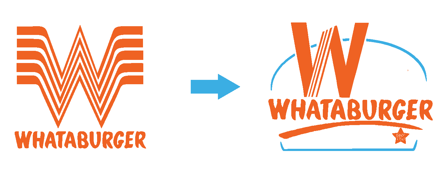
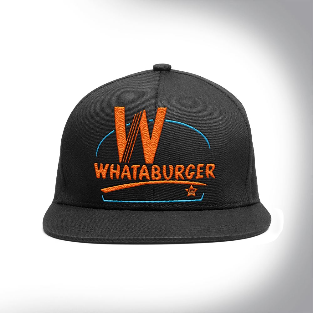
Logo Design
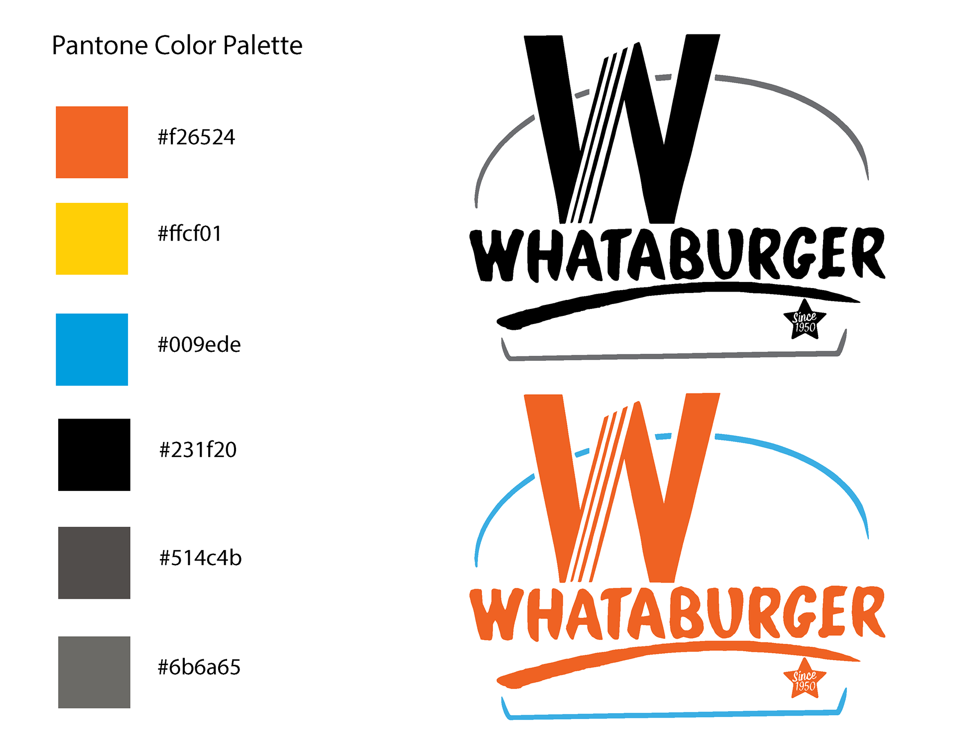
Color Palette
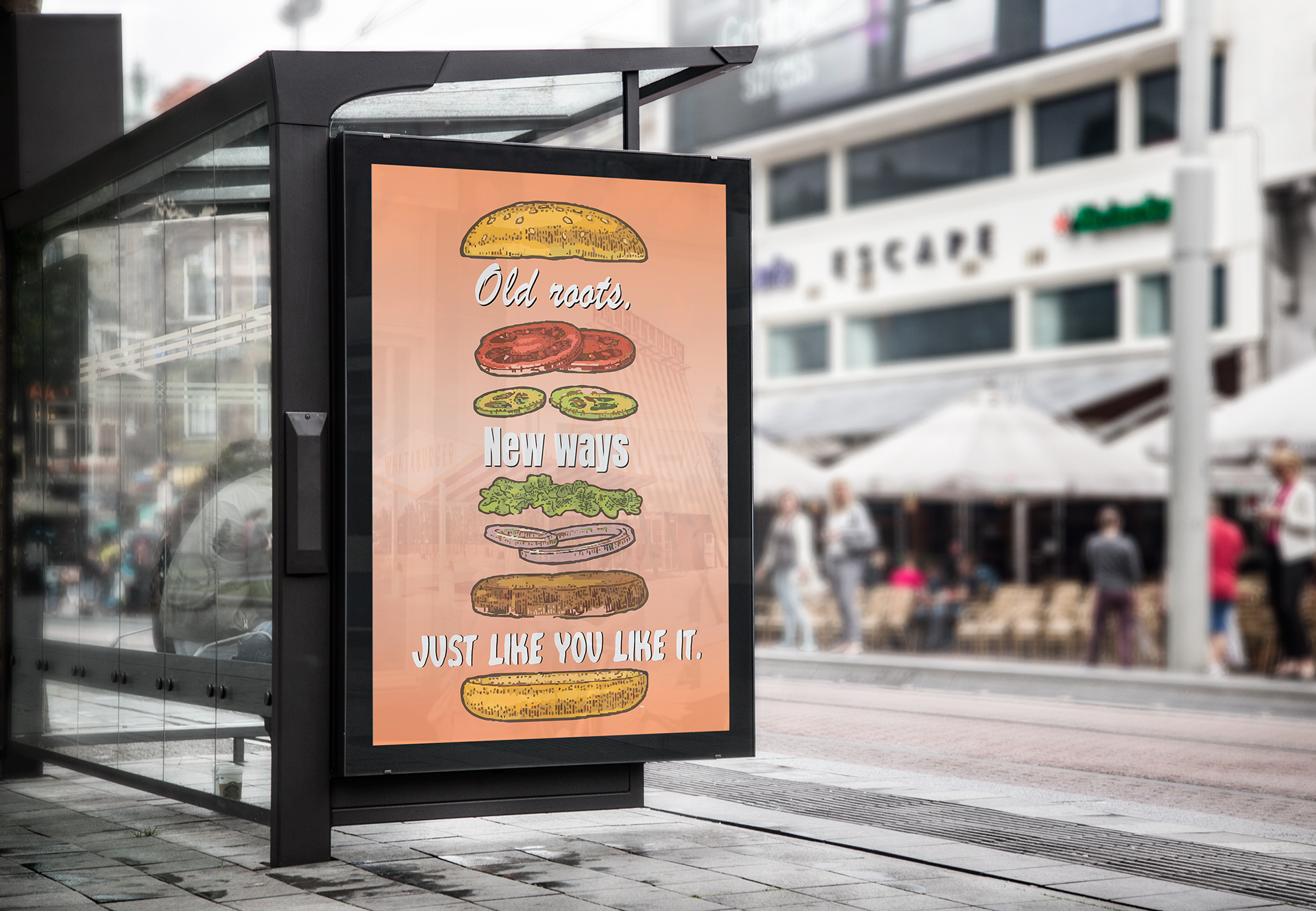
Promotional Poster
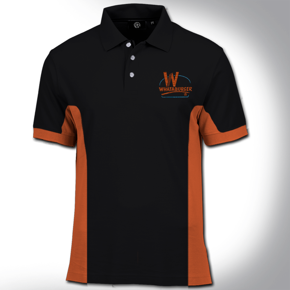
Employee Uniform
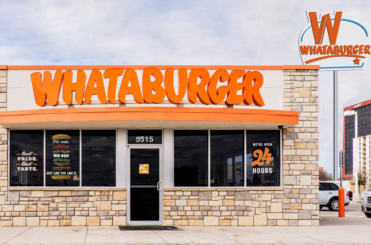
Signage Design
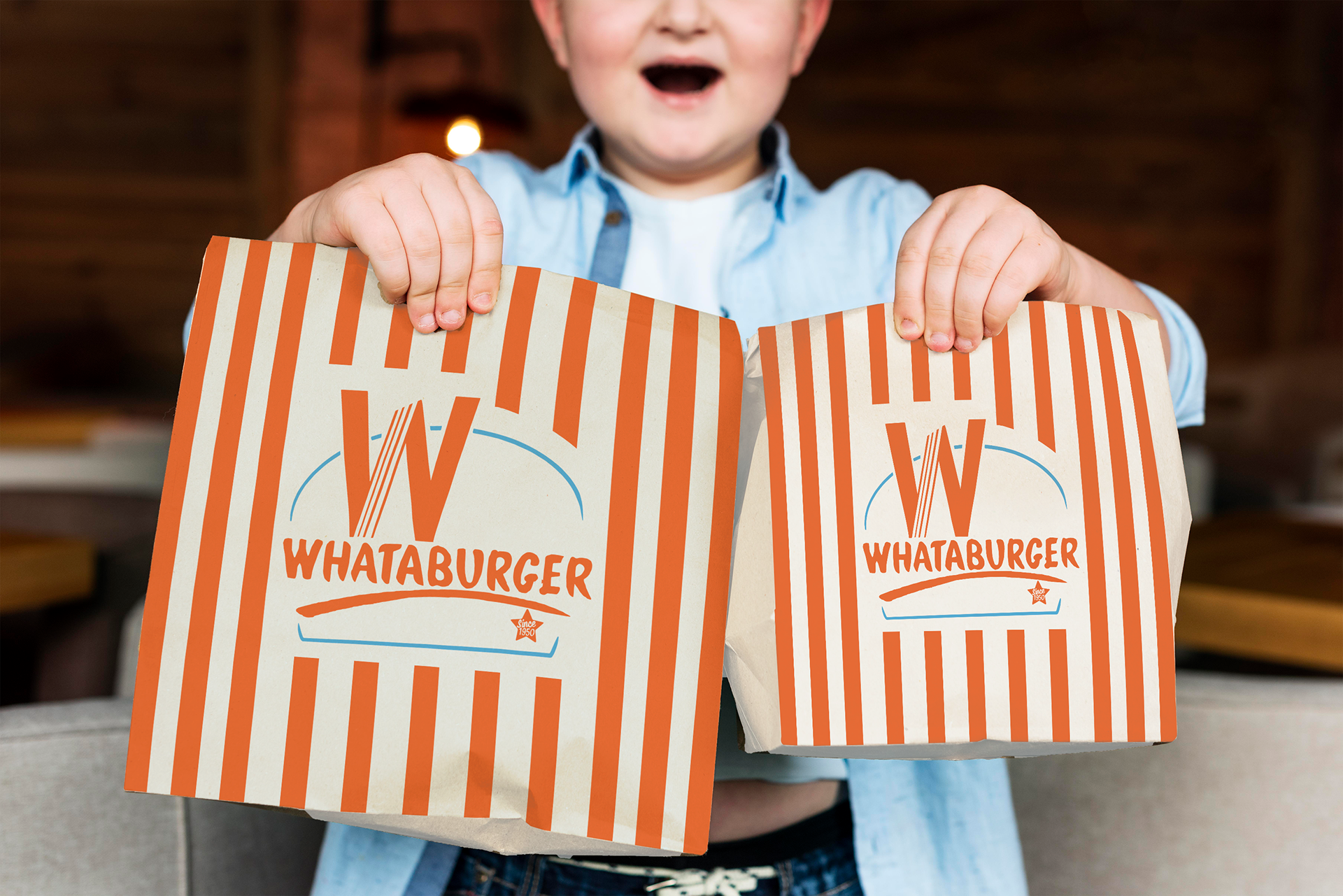
Package Design
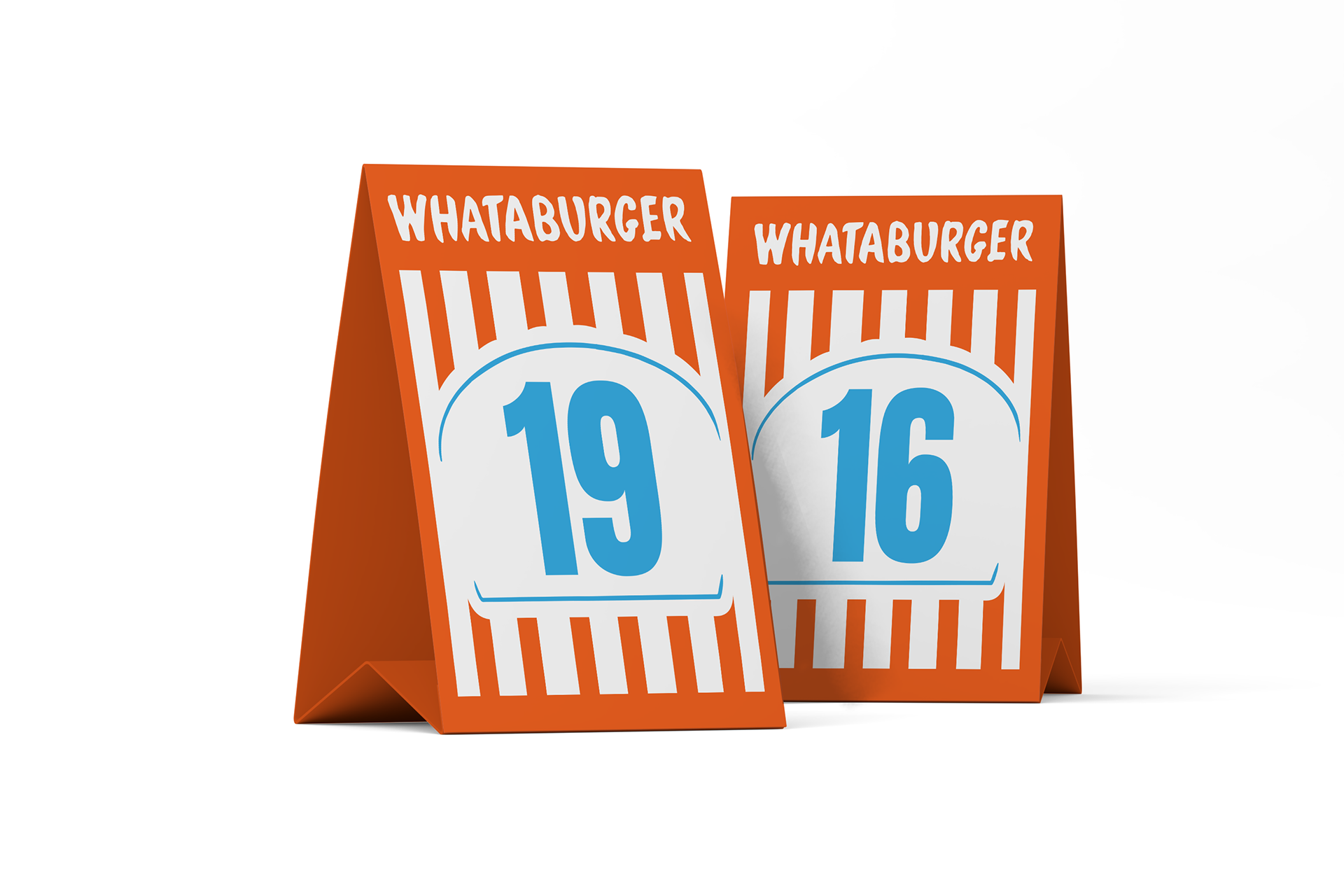
Table Tent Design
Web Ad Banners
As a native Texan, I was disheartened to hear that Whataburger had been sold to a company in Chicago, and its iconic orange "W" was at risk of losing its roots. To preserve the brand's essence and legacy, I took on the challenge of redesigning its identity. By incorporating the traditional Texas colors and values, I created a new, memorable brand identity that would resonate with all Whataburger lovers. My aim was to create a promotional slogan that would attract customers: "old roots, new ways, just like you like it. To ensure a cohesive brand identity, I designed new uniforms and web banners that could be used for ads and promotions. The new logo is inspired by the original building's style, with lines from the previous logo, and a hamburger shape. The design represents the brand's history and evolution while staying true to its roots. As Whataburger expands nationwide, I'm excited to see how the new branding will be received by fans and look forward to its continued success.